Samba Safety
This project has become a case study for Pivotal Labs. View it here
The Problem:
Samba Safety deals with driver risk and helping companies with the fleet management of all of their drivers. Do they have the correct certifications? Did they recently have a DUI? Their services are vital to thousands of clients, but the experience of their application was a mess. They had customers not renewing their contracts due to an interface that focused on flair (unnecessary drag and drop, unintelligible charts) at the cost of workflow and user empowerment.
Their product development primarily consisted of reacting to threats of customers leaving. Their teams were demoralized, and there wasn’t a lot of hope on the horizon.
2x2 exercises are a great way to identify which features will deliver the most impact at the lowest amount of effort, meaning we can both deliver to users faster, and stay focused on the important tasks.
The lessons & the research:
We knew we needed to get back to basics. Samba had a very common point of view - they wanted the product team from pivotal to, “not think of today’s problems, but jump ahead to the future.” They were behind the curve of their competitors, and that panic made them feel that the only way forward was to leapfrog their competition. We convinced them that we needed to understand how their customers viewed driver risk and fleet management before we could begin considering what “the future” would look like.
They were scared, and that’s understandable. After teaching their team how to conduct user research in a fast, yet effective way, we set out to not ask their customers what they wanted…but how they did their jobs. What made their jobs harder, and what they enjoyed about them. What were their moments of empowerment, and why was safety important to them?
We taught their team how to conduct contextual-inquiry style interviews, as well as how to synthesize that research into actionable, valuable findings. We worked with them on prioritizing our most critical features that we needed to knock out of the park, and which ones we could save for the future. We moved in a lean fashion to ensure development could start early without adversely impacting a fast-moving design process.
Insight doesn’t stop at a couple of user interviews, and with a team full of strong opinions about design, we knew that in order to deliver value to their customers, we needed to get prototypes in front of users. We taught Samba Safety that being wrong is ok by showing them how we reacted when design decisions were invalidated by the users who have to live with them. It took a couple of tries, but we switched them from a position of fear, to one of excitement. Knowing is always better than guessing.
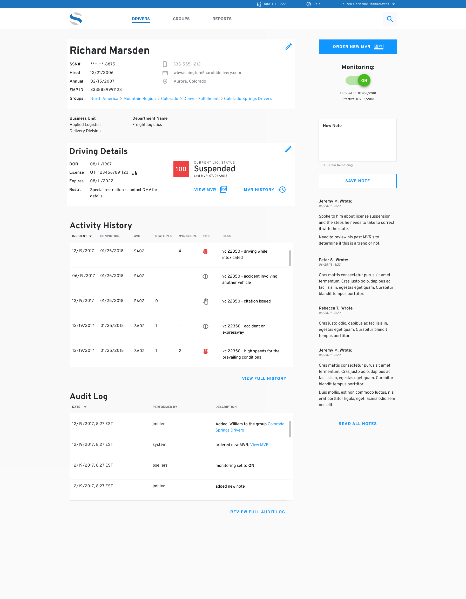
The driver dashboard allows customers to evaluate their fleet of drivers and prioritize drivers at risk of losing their licenses or in need of training and support. The design made scanning and identification of work to be done extremely fast, and smart use of color and iconography made it easy to ‘grok’ the status of a driver at a glance.
The Solution:
Visually their brand guidelines were a bit confused - their logo was designed by a former head of marketing, and their brand typeface was Arial. We flattened out the logomark (removing the gradients and drop shadows), introduced Overpass as a stronger sans-serif to replace Arial, and brightened up their palette to feel lively, rather than muted.
Users raved about the new designs, and were excited to see what Samba would do next.
We made sure that data was scannable at every turn - what were the events or drivers I needed to pay attention to? What’s the most important task I need to work on? Iconography was used primarily to denote the state of a license (type, expired, etc), and always accompanied with tooltips. With an aging customer base with declining eye sight, we knew that we couldn’t use color alone to identify important tasks or subjects, so we were sure to always include data values along with color changes. The interface was dynamic, responsive to users, and information-dense without being information-heavy.


