Lockheed Martin STARS
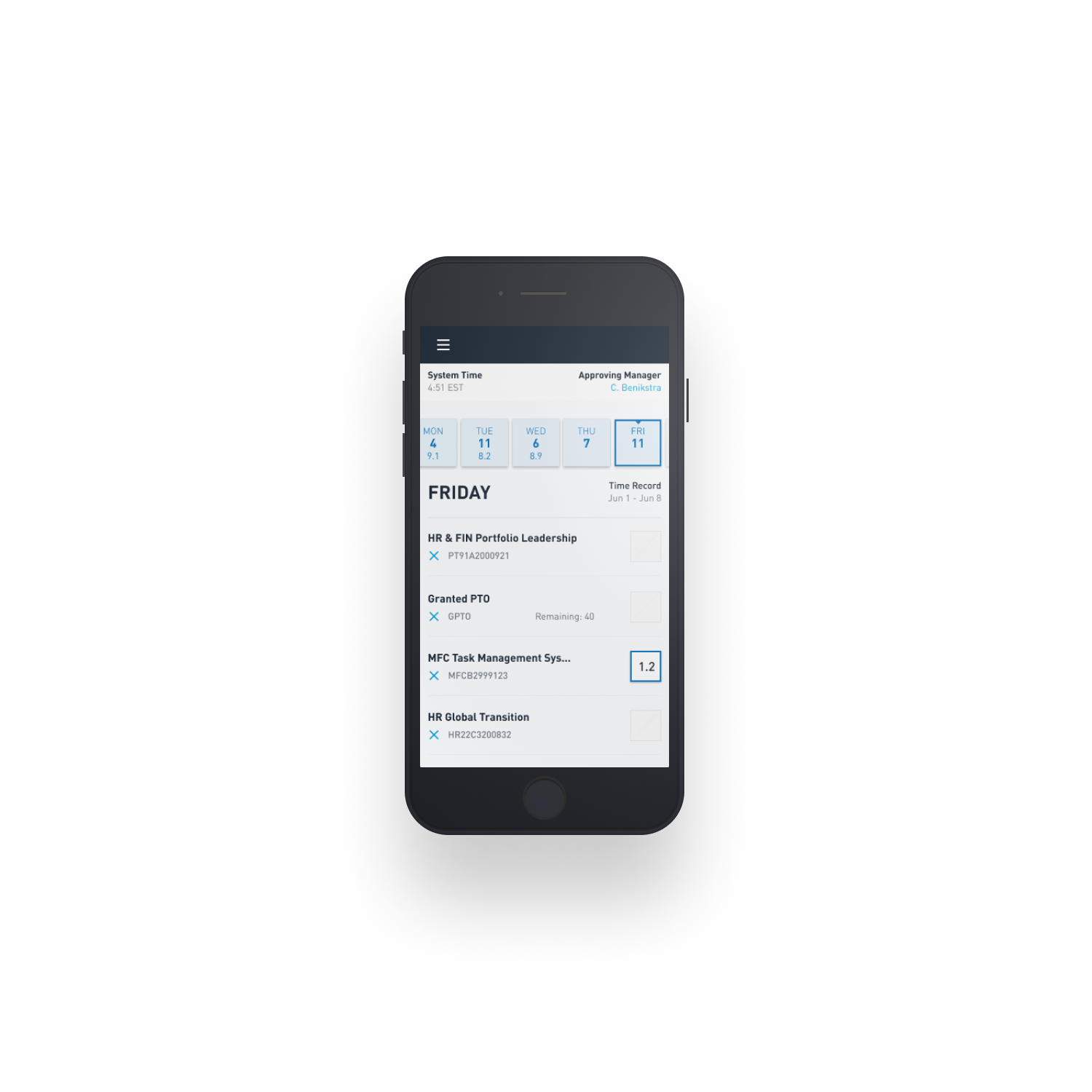
Time entry needed to be precise, but we also needed to reduce friction. Task codes persisted until a user removed them; days off and holidays were baked into the calendaring.
The Problem:
Government contracting is *hard.* Any time spent on a task that’s more than six minutes in length needs to be logged, both the length and the reasons for the work. There are thousands upon thousands of job codes, and any employee may be working on up to 16 projects in a single week. As a government contractor, there’s not a lot of room for error.
But their problems weren’t just user-centric. Their existing platform, STARS, was written in 1985 by a college grad. It was still on a mainframe. It didn’t even have a web front-end for the first 20 years of its existence, and LM was seen as a company for old white men because of it. They didn’t just need a new application, they needed to show their leadership that changing how they approach software is critical to Lockheed making better products.
The Work:
There were mountains of assumption and tribal myths running around LM when it came to time tracking - some folks would keep journals out of fear they may be audited. Others thought that, by law, employees must enter job codes manually every week. If we were going to save LM employees time while increase their accuracy, we needed to get to the underpinnings of some of these cultural myths.
We spoke to employees from every level, and every age. We talked to them about how they viewed time tracking, what they did to keep themselves safe from audit, and what kind of mistakes they made. We learned how they viewed their company and its role in government work, and that they all wished they could spend more time doing the work they loved rather than the multiple hours a week they spent tracking their time.
We designed a series of prototypes that built off the leanings from each other, and made a simple style guide that allowed us to move quickly without sacrificing quality. After we had a solution with evidence to back it up, we brought together their leadership and took them through the entire journey - why we started the project, what their users thought and how they wanted to work, and even what parts of our prototypes failed…and how we learned from those failures.
Sometimes it’s not enough to just present a final design and hope people will accept your solution. Sometimes you need to walk through the whole journey, to help them better understand the narrative and the conclusions you drew.
Managers needed quick oversite as to the status of timesheets, when employees had requested time off, and how much overtime was being spent. The manager overview made all of these quickly scannable and actionable.
STARS was a fully responsive app from day 1; every feature was only released when it worked across all of our supported viewports. This reduced work significantly, compared to the common let’s-do-mobile-then-desktop-maybe-if-we-get-to-it approach that leaves a lot of interfaces brittle and broken.
The Design:
Our #1 goal was clear: The interface needed to communicate the state of a timesheet and what was actually required by the user to do next. Users were in and out of their time sheets at various points in the day, and it was important that it quickly explained which timecodes already had entries, which ones didn’t, and how they were faring both for that day and the entire week.
Despite being an information-dense application, we maximized whitespace and leveraged strong typography to increase scannability of the application. A user’s unique job schedule was also auto-populated into their timesheet, so that way they knew where they needed to add hours, and avoid “fat fingering.”
Plenty of users would forget to enter their time, pull over on the side of the road, and complete their timesheet for the day. A mobile viewport was critical, but we felt a tablet view was unnecessary - we made sure to design the desktop viewport to fit as many screens as possible, in an effort to help keep the application maintainable from a developer standpoint.
As a daily-use app, we wanted to make sure that users could pick it up (relatively) easily, but could become power users over time. Managers received views that allowed them to easily see how their employees were doing, but not getting into the what - a manager’s primary concern was that their employees were entering time on a daily basis, but not how they were dividing their time. We removed individual time code tracking, and made a simple, easy-to-scan view that told a manager who they needed to remind to enter time, who was out on a given day, and maybe who needs to be pushed to do better.


