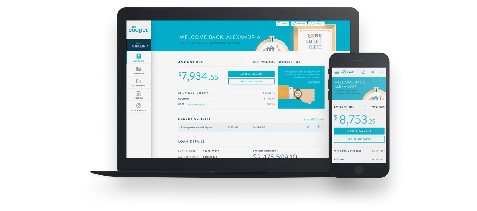
Mr. Cooper Mortgage Platform

UX · UI · Research & Testing · CSS · Responsive · Fintech

A Responsive Mortgage Servicing Platform with white label functionality.

Mr. Cooper Mortgage Platform cover

The Design

Instead of traditional wireframes-then-visual-design workflows, we added fidelity to features over time. Everything was always in a 'final' design state, but as tokens and styling were defined, the application was updated globally.

This allowed us to keep moving fast while still delivering a high quality experience. Consistent updates to visual fidelity helped build trust with stakeholders and helped them focus on the decisions in front of them (Every UX designer has had a stakeholder focus on visuals too much).

01

Loan Overview - Mr. Cooper

As a mortgage servicing platform, payments had to be front and center - the vast majority of users only log in when they need to modify payment information or make a payment.

We next go on to answering questions - what are the details of my loan? Did something recently happen with it? The smartest homeowner section ends the page with important mortgage and property tools that help build rapport and value with their customer base, that didn't always choose to work with Mr. Cooper (Mortgages can be bought and sold)
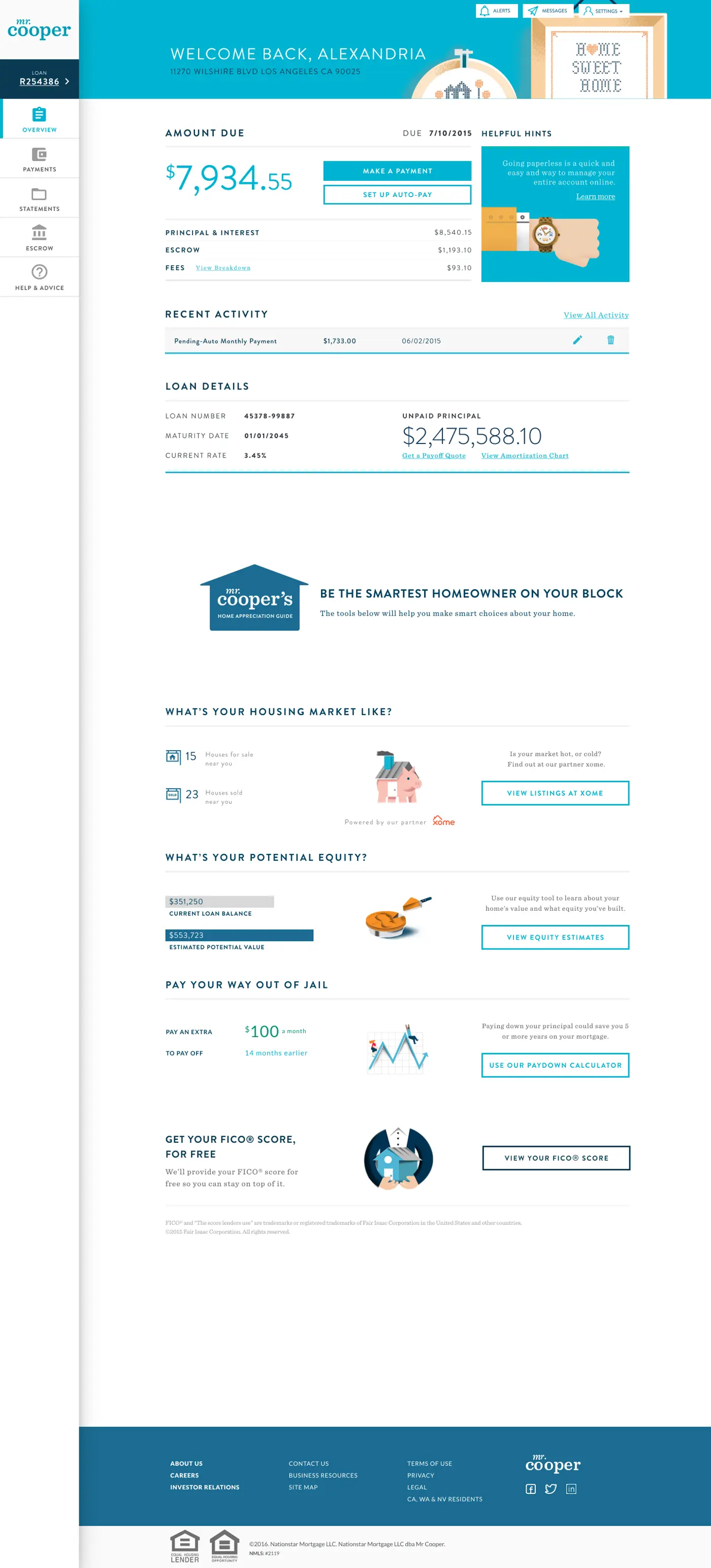
Loan overview on desktop — Mr. Cooper brand
02

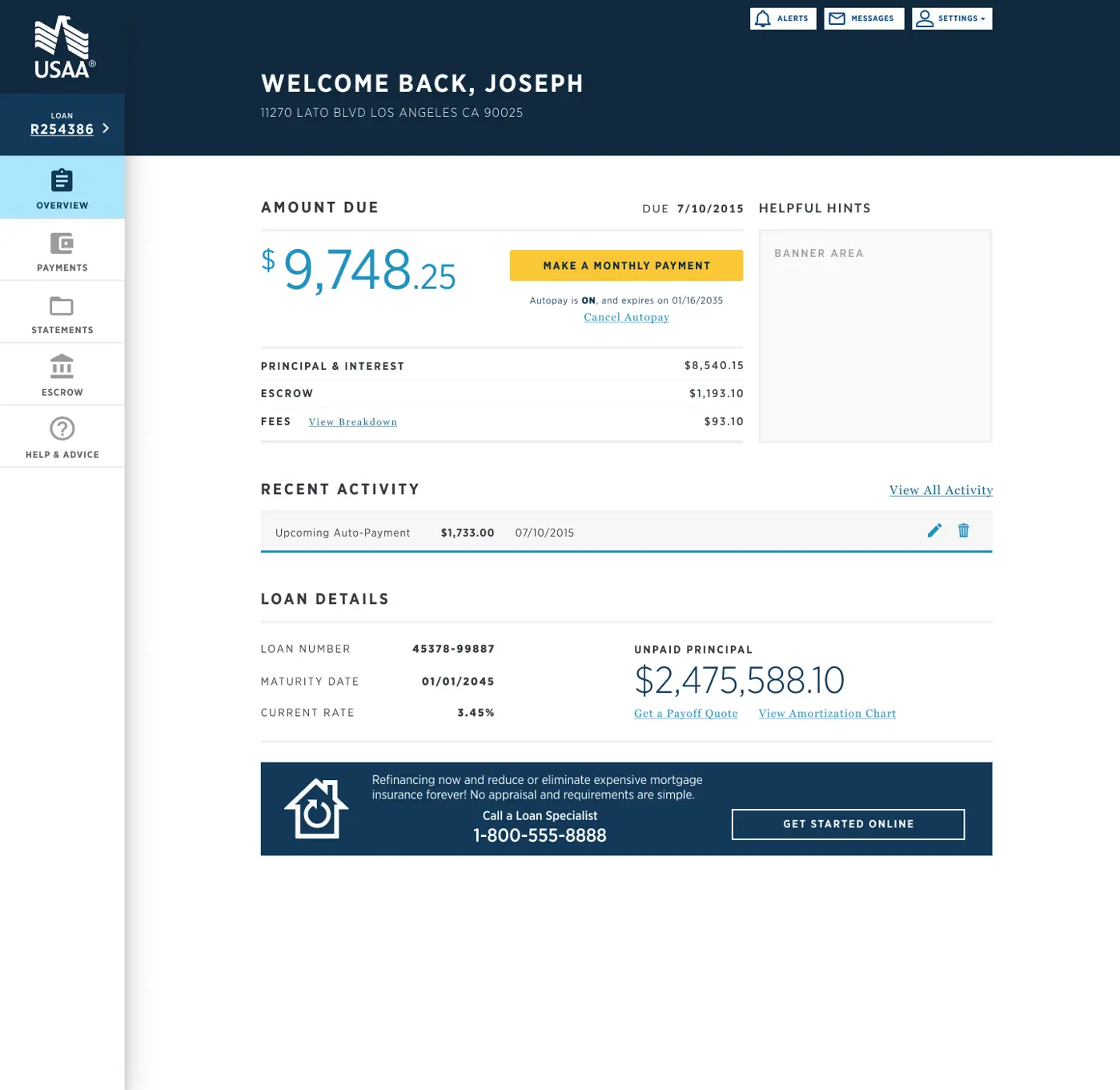
Loan Overview - White Label

Their platform needed to be white-labeled, which was an challenge. How do you have a white labelled platform that's based on something highly opinionated like their brand?

We chose a 3 primary color system: - Primary - base primary color, used sparingly as an accent, most interactive. - Primary Interactive - exclusively for interactions - Interactive Accent - exclusively for 'hero' interactions.

For Mr. Cooper, their cyan could be used for all 3, but for white-label customers, it provided a level of fidelity while respecting cognitive load concerns with color.

Loan overview in USAA white-label theme

Payments

03

Autopayments

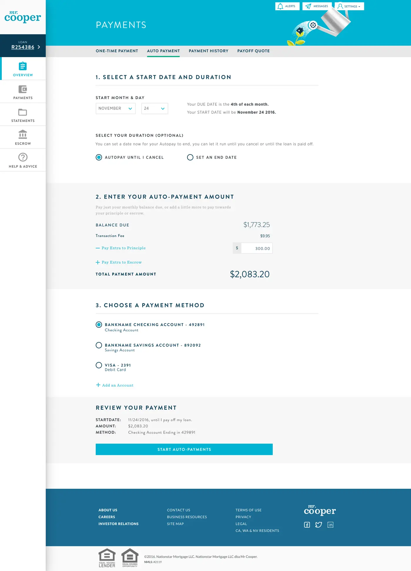
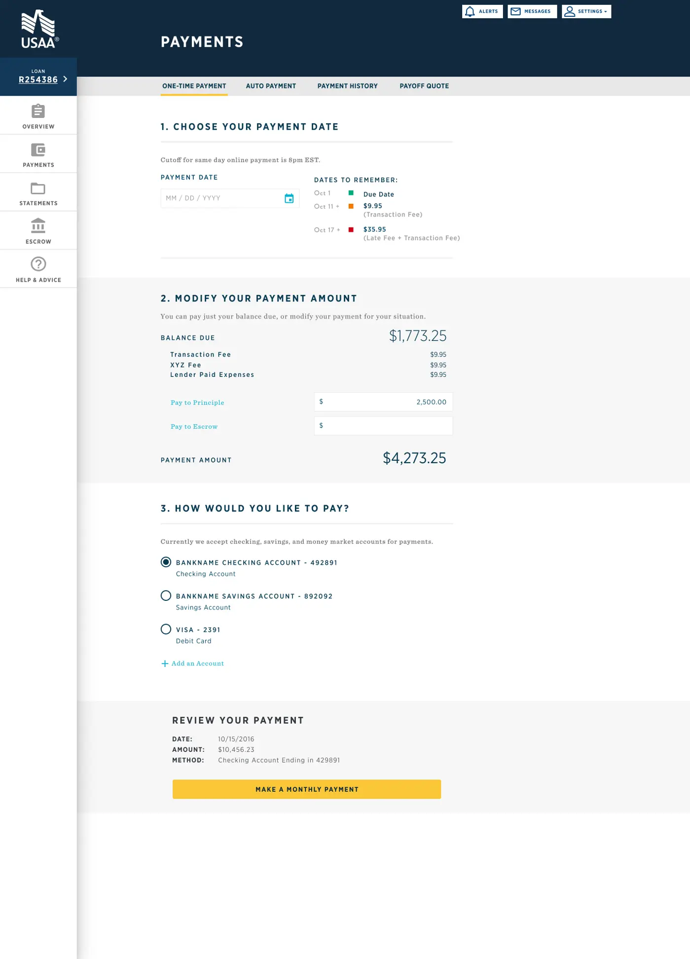
Due to legacy platfrom constraints, auto-pay and one time needed to be distinct interfaces rather than a singular experience. To avoid user-confusion, we made sure the top of each page was the most distinct (while re-using other components) - that way a user would have an instant visual 'shape' cue that they were in the place they intended.

Autopayments interface — Mr. Cooper brand
Autopayments — Mr. Cooper
04

One-Time Payments

One-time payments USAA-branded view
One-time Payments — USAA
05

Mobile Viewport

One-time payment monthly review — mobile, USAA branded
One-time Payments — Monthly Review, USAA Mobile
Loan overview on mobile viewport
Loan Overview — Mobile